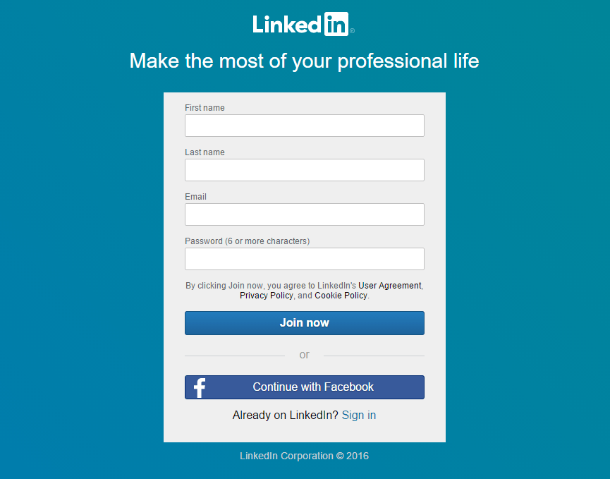
What are Lead Generation Landing Pages?
A lead generation landing page is a place where your prospects “land” after clicking on an advertisement or a post.
It invites them to sign up, buy, or subscribe.
That means you don’t have to hope and wait for your audience to stumble upon your call to action (CTA) somewhere on your website.
There are two kinds of lead generation landing pages.
One is for collecting your target market’s information while the other is a checkout or purchase page.
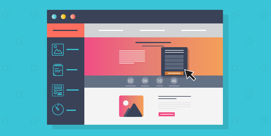
A lead generation page is the first step in your conversion funnel. It is where the prospects provide information in exchange for a free guide or resource.
The information usually includes their name, company, email, and phone number.
But, the information collected can vary depending on the goal and the industry.
The data you’ve collected is then assessed to determine which of those leads are qualified.
Once you’ve made your final list of leads, you can start nurturing them to close a sale.
A landing page lead generation should be done right for it to be beneficial to a business.
It should provide more context about a certain service or product on the ad the prospects clicked.
Moreover, it should be only focused on a single offer.
The best lead gen landing pages should point to a clear next step and use action-oriented copy, and eye-catching imagery.
Every company that uses email marketing in nurturing leads can benefit from using lead generation pages.
Before you build lead generation landing pages, ask yourself the following questions:
What is My Goal?
What would your customers do upon reaching your landing page? Do you want them to…
- Buy something?
- Fill out a form?
- Sign up for a newsletter?
- Download an eBook?
Remember that the first step to any marketing strategy is determining your goals.
You can’t track your conversions without defining your conversions first.
Who are My Competitors?
Find out who your competitions are and monitor their movements.
As explained by Ispionage, there’s a lot you can learn by monitoring your competitor’s landing pages.
One of the reasons why you should monitor your competitors is because they might be calling you out.
You need to have a counterpart for statements that your competitors might have against or about you.
Who is My Target Audience?
Know your audience’s needs, wants, hopes, and dreams.
That might sound a bit too much but it’s actually necessary.
The better you understand them, the more likely you can offer a solution for them.
How Do Prospects Get to My Landing Page?
Craft a unique message depending on where your audience came from.
For instance, you can have different messages for people from Twitter, Facebook, or Google.
Companies that have more lead gen pages can generate up to 7 times more leads than businesses that only have a handful.
Ideally, you’d need a tailored landing page for each ad group but that can be challenging.
You can begin with one custom landing page per campaign and continue adding from there.
Lead Generation Landing Page Best Practices
There are different things you should put in place to generate more leads to your website.
Whether your business focuses on B2B lead generation, SaaS, or eCommerce, your digital marketing can only be successful if you generate high-quality traffic that converts.
Here are the best practices for lead generation landing page:
Create Winning Call-To-Actions
If you want the best landing page for lead generation, then you should work on your call to action.
As the phrase implies, it encourages your prospect to take action.
The most common actions possible are:
- Asking for a contact or a callback
- Reserving a product or service
- Purchasing a product or service
- Availing of the free trial (may include personal and bank details)
- Filling out a registration form (personal details)
- Subscribing to a newsletter (requires an email address)
Your call to action is the culmination of your proposal. It should be highlighted and should go together with a sales pitch.
Add Testimonials on Your Page
First things first, it’s best if testimonials come from REAL customers.
Those will work as social proof.
The more testimonials you have, the more likely your potential clients will trust your business.

(Image Source: Brafton)
Create Exclusive and Limited Offers
A famous saying goes: “Time is gold”. But when it comes to landing pages lead generation, time is money.
You can increase your conversion rates by having exclusive offers for a limited time.
When you set a deadline to grab a very tempting offer, customers will decide more quickly.
Their human instincts would tell them that they shouldn’t miss out on the offer.
Tailor Your Resources Based on Your Target Market
Let’s face it, there are a lot of “good” landing pages out there.
But to have one of the best lead generation landing pages, you should create valuable content based on your target market’s persona.
The goal here is to create interesting and easy-to-understand resources that will introduce your audience to your services and help you reinforce your authority.
You can be as creative as you want because the possibilities are endless. However, the most common types of resources are:
- Articles
- Guides
- Videos
- E-books
- infographics
Perform A/B testing to Improve Your Conversion Rate
Performing A/B testing can increase add-to-cart conversion by 159%.
Through A/B testing, you can assess your page’s performance by comparing two versions of a similar page.
Page “A” will be called the “control” while Page “B” will be called the “variant”.
In the test, you’re going to measure the performance of Page B.
For instance, you have landing page A then you’d create another landing page where you altered the form to increase the number of leads.
You’ll then use an A/B testing tool to create a variant of your landing page A that will contain the edited form.
After a few weeks or a few days, you’ll get the results.
From there, you’ll see which of the pages brought you more leads.
Craft a Page For Each Customer Type
It may be tempting to have an all-in-one lead generation landing page design, but that won’t increase your chances of getting more leads.
Each visitor should be treated uniquely, which means you would need to create a personalized experience for each one.
To create the best landing pages for lead generation, you have to identify first the segments of visitors your website gets.
For this task, you would need the help of Google Analytics.
Click “Audience”, then “Demographics”.
It will then direct you to a page full of detailed information on the visitors’ number of sessions sorted according to geographical origin, sex, age, etc.
Study the data and create pages according to different segments.
Pay Close Attention to Your Conversion Funnel
Your conversion funnel includes the entire process that turns a website visitor into a lead, or better yet, a customer.
When working on a shopping funnel, you should make sure that your landing pages and acquisition channels are consistent.
To ensure maximum conversions, the marketing message should be the same throughout.
Highlight the Benefits of Your Offers
On your landing page, you should create content with your target audience in mind.
Remember that this is not about your company, this is all about them.
Some visitors are not interested in the stuff your business can do.
Instead, they want to know what’s in it for them if they take your offer.
Are the services or products beneficial to them?
In short, provide them value.
Design High-Quality Forms
When you want to achieve the best landing page to send traffic for lead generation, you should look after your forms.
This element determines the willingness of your visitors to provide their personal information.
Creating forms is like making great calls to action. For your forms to be effective, you should:
- Give an exciting and clear valued proposition
- Choose attractive colors to use for the design
- Make your forms stand out from the rest of the page

Here are a few steps you can do to ensure that your form converts:
Use Checkboxes and Buttons
When you’re filling out a form online, do you enjoy typing every information?
Of course not! The same goes for your visitors.
Instead of making them write lots of stuff, you can provide multiple selections, quizzes, or checkboxes.
Through this method, you’re the one who chooses the answers to check.
As a result, you can get better quality leads while increasing the quantity.
Do Mobile Optimization
Many companies receive more traffic from mobile devices but this can vary depending on the industry.
When creating a form, make sure that it’s mobile-friendly and responsive.
To have the best mobile lead gen landing pages, create forms that are particularly designed for mobiles.
That’s the only way you can be sure that your visitor can get an optimal view of your forms.
Ask for Minimal Information Only
Keep your forms at a minimum.
It’s both counterproductive and useless to ask your audience to provide a lot of information.
You don’t want them to run away and click on the “X” button in the upper right corner of the screen, right?
A good form contains only a few necessary information, such as the first and last name, a phone number, and an email address.
Highlight the Benefits
Just like CTA (Call To Action), you should focus on the benefits that the visitors get when they provide their personal information.
If you don’t offer them a relevant value proposition, they may choose not to share their data.
To get more leads, you shouldn’t hesitate to give them something in exchange for their information.
It can be a free trial, a newsletter, or an e-book.
Run Your Forms Through A/B Testing
Making changes to your forms to improve them is a good thing.
It’s a sign that you are aware of their importance for a lead generation landing page.
Now, the question is, how are you going to quantify your forms’ performance improvement?
For this, it’s recommended that you do an A/B testing.
Through testing, you’ll determine which of your landing pages work best.
|Is it the one with the previous form or the other one with the new form?
After analysis, a detailed performance report will be provided. It highlights the effectiveness of the things you added or removed.
Pay Attention to Your Landing Page Designs
A pre-designed landing page doesn’t inspire confidence.
So, the first step to generating more leads is working on your landing page’s design.
Generally, you want to create a design that’s understandable and clear for your visitors. To do this, you should:
- Let your text breathe so they can be easily read
- Experiment on symmetry and shapes
- Make a clear difference among your paragraph titles
- Harmonize your theme’s colors
If you have several offers, you can highlight the specific offer they saw on your ad that led them to your landing page.
Bonus tip! If you’ve done all these lead generation landing page best practices, and it still doesn’t convert customers into leads, then you should do something different.
You can use new methods that can help you understand why your leads are not converting.
Search for tools that helps you visualize how visitors interact with your pages like Session Recording or Heat Maps.
Best Lead Generation Landing Page Examples
Looking for lead generation landing page inspiration?
Here are some beautiful lead generation design samples.
Mixpanel
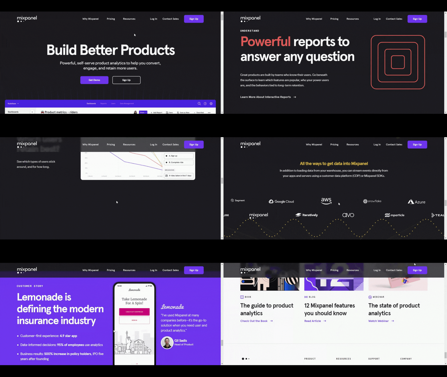
One of the best features of Mixpanel’s landing page is the GIF header.
It gives visitors a quick look at the tool, unlike other SaaS sites that fail to provide examples or pictures of what the product looks like.
When visitors arrive at your landing page, they would want to see what they would get when they decide to sign up.
On Mixpanel, they highlight the visitor’s benefits. Instead of forcing their customers to read more, they are showing them the value proposition.
Western Rise
Social media became a significant factor in the rise of e-commerce. In fact, 54% of people use social media to find products.
That’s exactly the reason why you need a good mobile landing page.
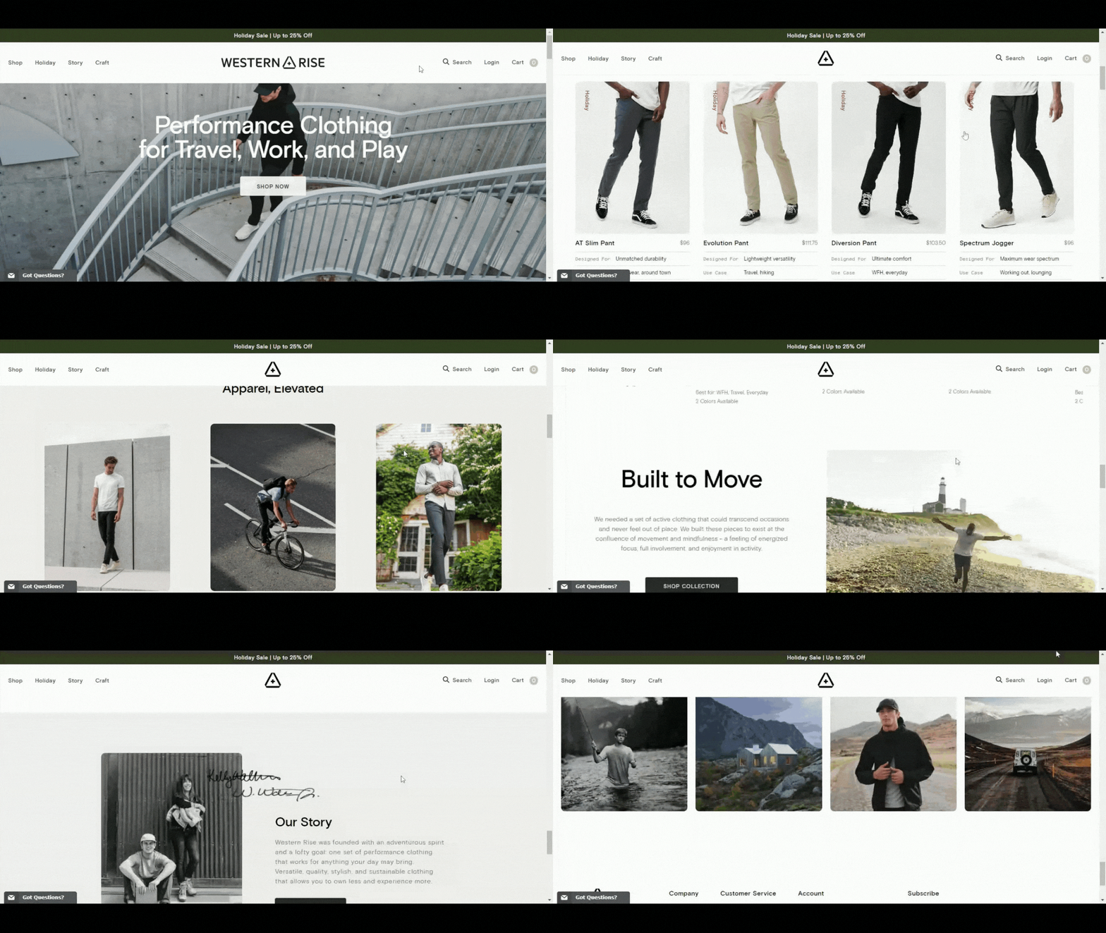
Western Rise’s is one of the best mobile lead generation examples.
When you visit the page, you’ll see that they have optimized their images, highlighted their products, and maintained a unified experience all throughout.
Falcon.io
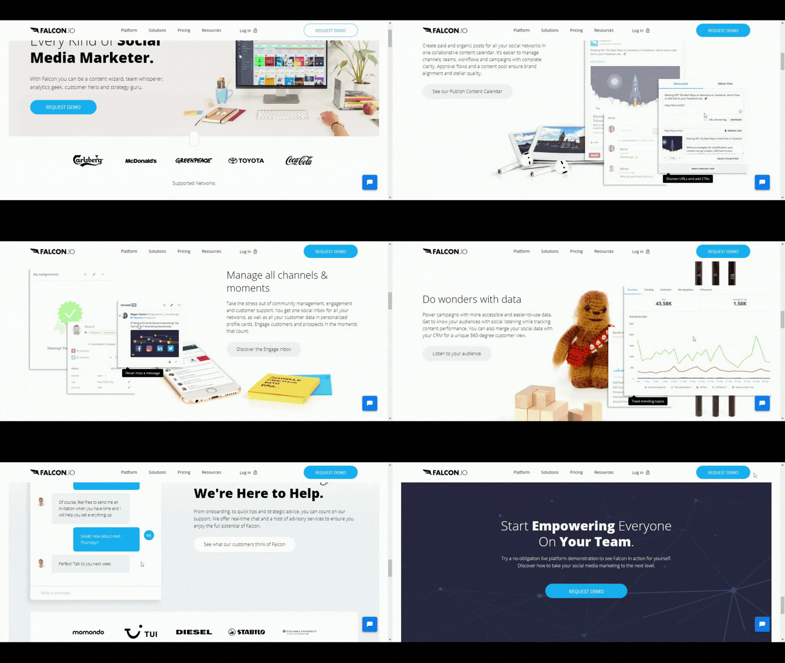
Here is another good example of a lead generation landing page that gives users a rundown of the benefits and features.
It even has a straightforward headline that says “Social Media Management Made Simple”.
It cuts to the chase so the visitors will know what to expect.
Shortlist
If you want to achieve the best consultation lead generation landing page that converts, then you need a page that strikes a balance between copy and design.
For instance, the Shortlist consultation agency uses colorful illustrations and muted color patterns.
Also, they have social proof in the form of brands, a bold red CTA, and a creative sales copy.

FireEye
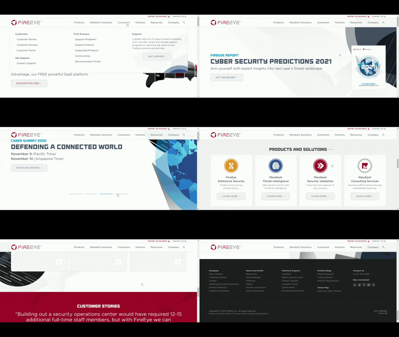
FireEye is a lead generation landing page example with a strong headline that sells white paper.
When a user lands on the page, they’ll know that the download offers information about protecting their data from cyber-attacks.
What’s even better is FireEye lets its users know that executives of particular niches wrote the content.
That means they know a great deal about the topic.
Shopify
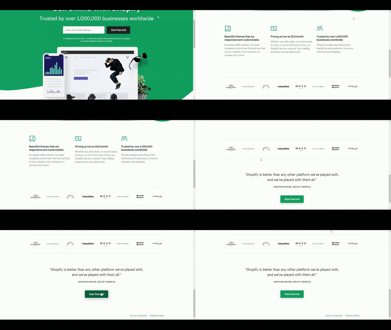
An enterprise lead generation landing page must be simple. A good example is Shopify’s trial landing page.
The headline contains a few words, and the page has bullets instead of paragraphs.
It is a lead generation page that requires users to fill out only a few fields before getting started.
You can use these landing pages lead generation sample designs as inspiration for your page.
If you’ve been getting leads through telemarketing or phone calls, integrating a landing page will surely give better conversion results.
Long-Form Landing Pages vs. Short-Form Landing Pages
Conversion results can vary depending on different factors.
Therefore, it’s best if you experiment with the two. You can test both and see which one works best for your visitors.
The Pros and Cons of Long Landing Pages
Lead generation long-form landing page is good for building credibility and trust among your visitors.
When you use this, you’ll have more room for information which means more time to convince your users to take action.
The good thing about this is the visitors who scrolled down to the bottom to sign up are most likely quality leads.
On top of that, the more optimized visuals and quality text, the better your ranking will be in search engines.
Longer landing pages work best for companies that have product offerings and require visitors to fill out a form in purchasing an item.
When a possible customer is planning to make a purchase, they’d need every information they can get about your product.
Aside from this type of landing page encourages people to buy, it can also help you build a relationship with them.
The downside here is, you may receive less leads compared to short-form landing pages.
With all the content on the page, there’ll be lots of elements of distraction in clicking the “buy” button.
The Pros and Cons of Short Landing Pages
It is for businesses that want to achieve more leads.
With a shorter landing page, you can put less information, meaning fewer distractions.
You have a big chance of gaining clicks on that “subscribe” button, especially if you have a short sign-up form.
People who land on your page won’t hesitate to fill out your forms as it won’t be time-consuming on their part.
One of the major advantages of using short landing pages is it can help you increase conversions if the elements on your page are convincing enough for users to take action.
Many companies consider short and simple landing pages as an effective means of driving conversions.
However, the leads you’ll get will be lower in quality.
The quality decreases because you’re giving your visitors a much easier way to sign-up.
Overall, short landing pages offer a lower barrier to entry.
Conclusion
Closing more sales have been more challenging lately compared to previous years.
It is why you need to stay on top of your game by creating the best landing page for your website to generate leads.
Landing pages will serve as the face of your business, so make sure that it is a head-turner.
There will always be different types of landing pages. Not everyone will be attracted, that is why you need to make your landing pages memorable.
Make sure everything the customer needs is on your landing page. Make it as informative, as attractive, and as easy to use as possible.
If you perfect this, you’ll be getting qualified leads in no time.
Want to help contribute to future articles? Have data-backed and tactical advice to share? I’d love to hear from you!
We have over 60,000 monthly readers that would love to see it! Contact us and let's discuss your ideas!
